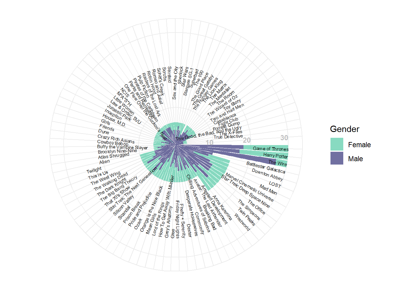
Data preparation
Working with the similar data as the previous treemap, first, the dataframe file is loaded from the directory.
load("~/COMM2501 Portfolio - z5218332/files/series_character_no.Rda")

library(dplyr)
##
## Attaching package: 'dplyr'## The following objects are masked from 'package:stats':
##
## filter, lag## The following objects are masked from 'package:base':
##
## intersect, setdiff, setequal, unionhead(series_character_no)## # A tibble: 6 x 5
## # Groups: Series [6]
## Series Female Male Total propMale
## <chr> <int> <int> <int> <dbl>
## 1 Alien 2 4 6 0.667
## 2 Anna Karenina 6 4 10 0.4
## 3 Arrested Development 3 7 10 0.7
## 4 Atlas Shrugged 1 5 6 0.833
## 5 Avatar: The Last Airbender 4 6 10 0.6
## 6 Battlestar Galactica 6 9 15 0.6To add a gap to put the axis later on, two rows would be inserted to the dataframe. Consequently, series titles would be extracted in descending order to label each bar in the plot later on.
blank_rows1 <- data.frame(Series=c("",""),
                         Total=c(as.integer(c(0,0)))) #create blank dataframe for the descending series list to add gap to the circular barplot later

#arranging series from highest to lowest total number of characters and adding the blank rows for circular barplot gap
series_desc <- series_character_no %>% arrange(desc(Total)) %>% select(Series, Total)
series_desc2 <- rbind(as.data.frame(series_desc),blank_rows1)
As ggplot2 stacked barplot requires the genders to be in rows instead of columns, a quick shortcut would be to make use of the character index dataframe.
load("~/COMM2501 Portfolio - z5218332/files/character_index.Rda")
character_index2 <- character_index %>% group_by(fictional_work, gender) %>%
  count()
colnames(character_index2)[1] <- "Series" #rename column to allow dataset binding

blank_rows2 <- data.frame(Series=c("","","",""),
                         gender=c("Female","Male","Female","Male"),
                         n=c(as.integer(c(0,0,0,0)))) #add blank rows for the character_index2 dataframe

character_index3 <- rbind(as.data.frame(character_index2),blank_rows2) #bind the dataframe with the empty rows
Data visualization
The circular barplot will be constructed using the ggplot2 package.
library(ggplot2)
library(viridis)
## Loading required package: viridisLite#parameters to fine tune the circular stacked barplot
series_label <- as.vector(series_desc2) #to label each bar of each series title
series_angle <- (pi/2)+((pi/2-2*pi*((1:92)))/(pi/2)) #base angle
series_label$angle <- ifelse(between(series_angle,-270, -90), series_angle+180, series_angle) #angle for each series title text
series_label$hjust <- ifelse(between(series_angle,-270, -90), 0, 1) #alignment
series_label$ypos <- series_label$Total + 15 #position of label
series_label$ypos[series_label$ypos>30] <- 30 #adjustment for label for high values
#plotting
ggplot(character_index3, aes(x=reorder(Series,-n), y=n)) +
geom_col(aes(fill=gender)) +
scale_y_continuous(breaks = seq(0, 30, 10), limits = c(0, 30)) +
coord_polar(start=pi/2, direction=1, clip="off") +
scale_fill_viridis(alpha=0.75, option="mako", begin=0.8, end=0.3, discrete=TRUE) +
theme_minimal() +
theme(axis.text = element_blank(), axis.title=element_blank()) +
geom_text(data=series_label, aes(x=1:92, y=ypos, label=Series),
color="Black", alpha=0.9, angle=series_label$angle,
hjust=series_label$hjust, size=2, inherit.aes=FALSE) +
annotate("text", x = 91, y = c(10,20,30), label = c("10","20","30"), color="grey", size=3 , angle=0, fontface="bold", hjust=1) +
guides(fill=guide_legend(title="Gender"))